
Derma Art
A personal practice. A recognisable look.
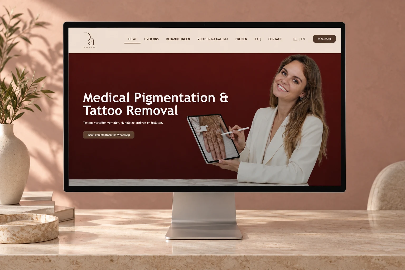
Logo, visual identity and website for Derma Art. Warm colours and a personal story give visitors a first introduction to Capucine's practice.
01
The identity starts with the letters.
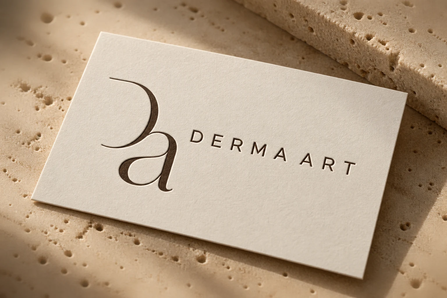
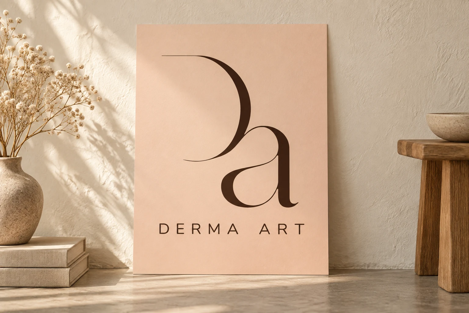
For Derma Art we created a logo and visual identity that carry through to the website. The mark joins the letters D and A in one flowing shape. Next to it sits a calm wordmark with space between the letters. The logo works both as the full name and in a compact version.
Dark brown and soft peach tones form the base. The contrast makes the brand recognisable without a harsh, clinical feel. The paper mockups show how the same identity works on a small format and on a larger surface. They are presentations of the design.
The website carries those choices into the navigation, the buttons and the background panels. So visitors do not see a different style each time, but one coherent practice.
02
Get to know her first. Then look further.
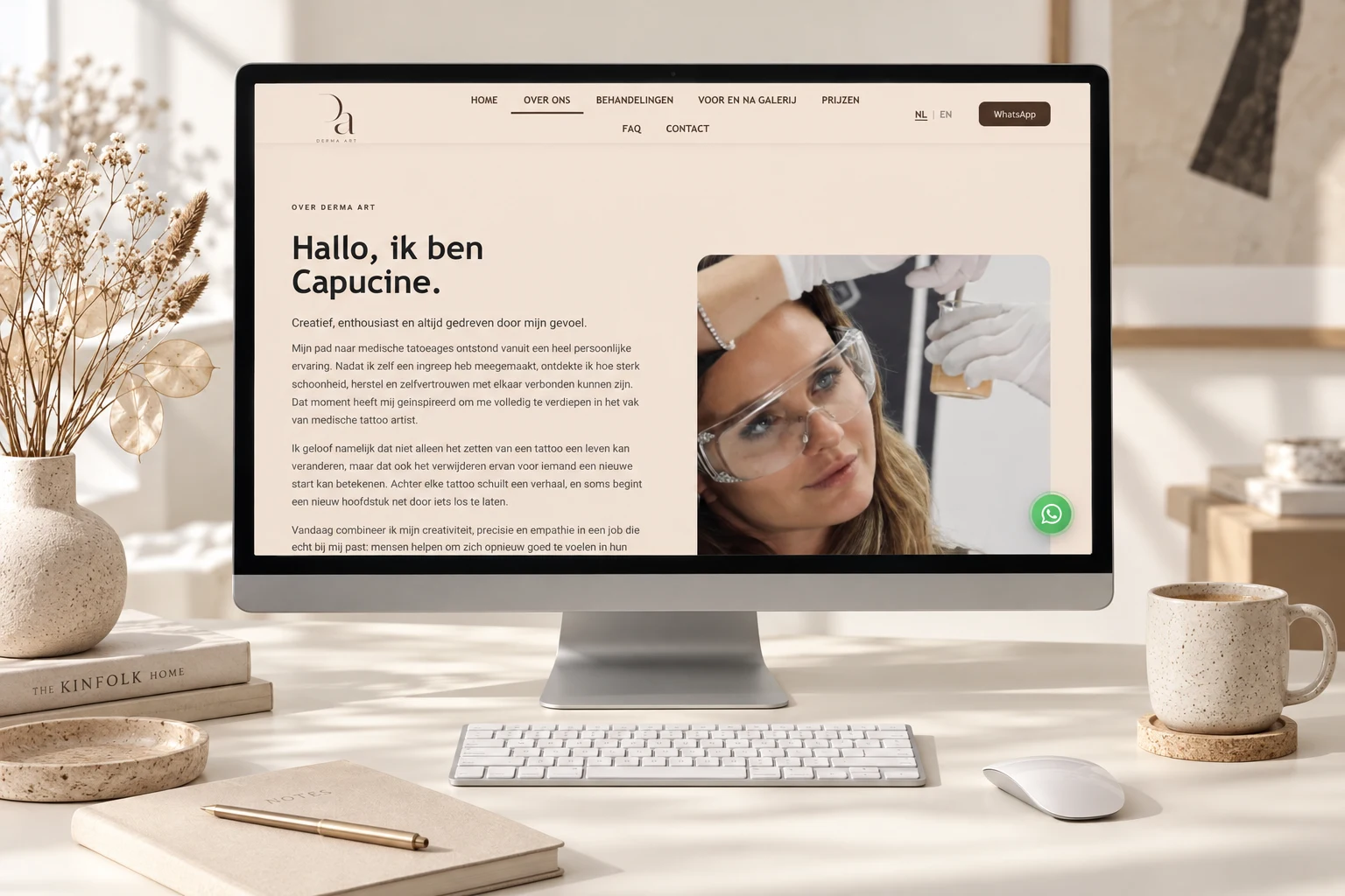
The homepage introduces the practice with a portrait and a short introduction. The page about Capucine gives her own story more room. That personal face is an important part of the presentation: visitors can get to know the person behind Derma Art before they get in touch.
The treatments, the frequently asked questions and the contact options each have a place of their own. The navigation also leads to the before-and-after gallery and the prices. That division means not everything has to be packed onto the homepage.
The website is available in Dutch and English. The language choice sits in the navigation, so visitors can keep reading in the same visual setting.
03
Asking a question should stay simple.
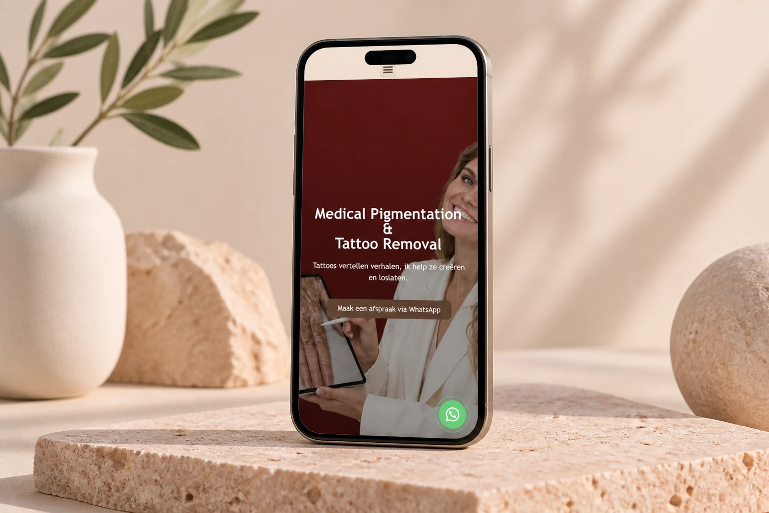
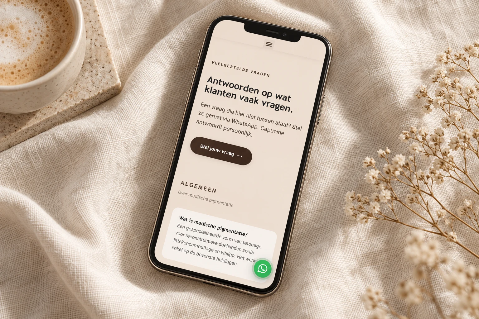
On mobile the content moves into one column. The introduction, images and buttons follow each other, while the menu stays compact. The homepage has a direct button to request an appointment through WhatsApp.
The page with frequently asked questions also offers a way to get in touch. If the answer is not there yet, visitors can ask their own question. That way the website leads to a personal introduction instead of sending visitors through more text.
The case shows the brand identity next to several real website pages. From the logo on paper to the mobile contact route, the same mix of colour, typography and photography stays visible.
Google review
“Vanaf het eerste contact begreep hij heel goed wat ik voor ogen had en hij heeft mijn ideeën echt prachtig tot leven gebracht. (…) Het eindresultaat van mijn website is zelfs nog mooier geworden dan ik had gehoopt!”
Our translation: “From the first contact he understood very well what I had in mind, and he brought my ideas to life beautifully. (…) The end result of my website turned out even more beautiful than I had hoped!”
Capucine Van de Velde, Derma Art★★★★★
Let's meet
Start
a project.
Launching a brand, building a website or reaching more customers? Choose what suits you best. Thierry replies himself, in English, within one working day.
Message received
Thank you, your message is in.
What happens next.
- Thierry reads it himself.Your message goes straight to the managing director, not to a salesperson.
- A reply today, within 1 working day at the latest.In English, with a first indicative price or a few focused questions about your project.
- A 20-minute introduction.Online, by phone or at our studio in the Antwerp Tower. After that you receive a proposal with a price per part.
During office hours Thierry answers the phone himself.
Three questions everyone asks.
What does it cost?
A one-pager starts from €995, a website from €2,500 and a webshop from €3,500, excluding VAT. You get a price per part, so you can choose for yourself. All prices
How long does it take?
A one-pager is usually live after 2 to 3 weeks, a website with several pages after 1 to 4 weeks. Timing and delivery depend on how quickly feedback, copy and images come in.
What should I prepare?
Nothing is required. Useful to have at hand: what your business does and for whom, two or three websites you like, your logo if you have one, and your timing and budget.
Client story
How it went for Derma Art.
A logo, visual identity and website for a personal practice.
“Vanaf het eerste contact begreep hij heel goed wat ik voor ogen had en hij heeft mijn ideeën echt prachtig tot leven gebracht. (…) Het eindresultaat van mijn website is zelfs nog mooier geworden dan ik had gehoopt!”
Our translation: “From the first contact he understood exactly what I had in mind and brought my ideas beautifully to life. (…) The final result of my website turned out even more beautiful than I had hoped!”
How it went for Shato.
Brand identity, catalogue and a website for premium event rentals, where categories and requests each get their own place.
Read the case (in Dutch)How it went for Eighteen.
A logo, visual identity and website for a kosher restaurant and event venue in Antwerp.
Read the caseHow it went for Bonbon Antwerp.
Brand identity, website, print and findability for a French-Belgian restaurant in Antwerp. In August 2026 it got 1,907 clicks from Google, from 9,087 impressions.
Source: Google Search Console.
Read the caseHow it went for Jin Bian House.
Web design with an on-location content shoot. Dishes and interior take centre stage on the website of the Asian restaurant.
Read the case (in Dutch)